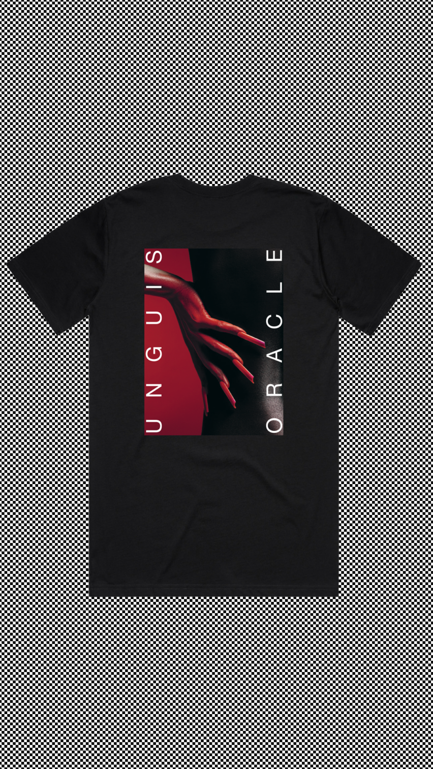
Personal Project: Unguis Oracle
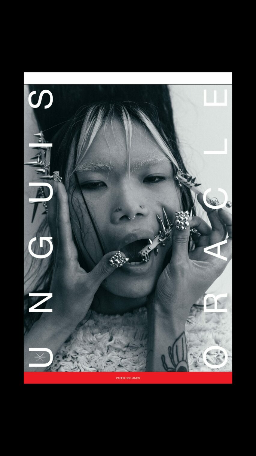
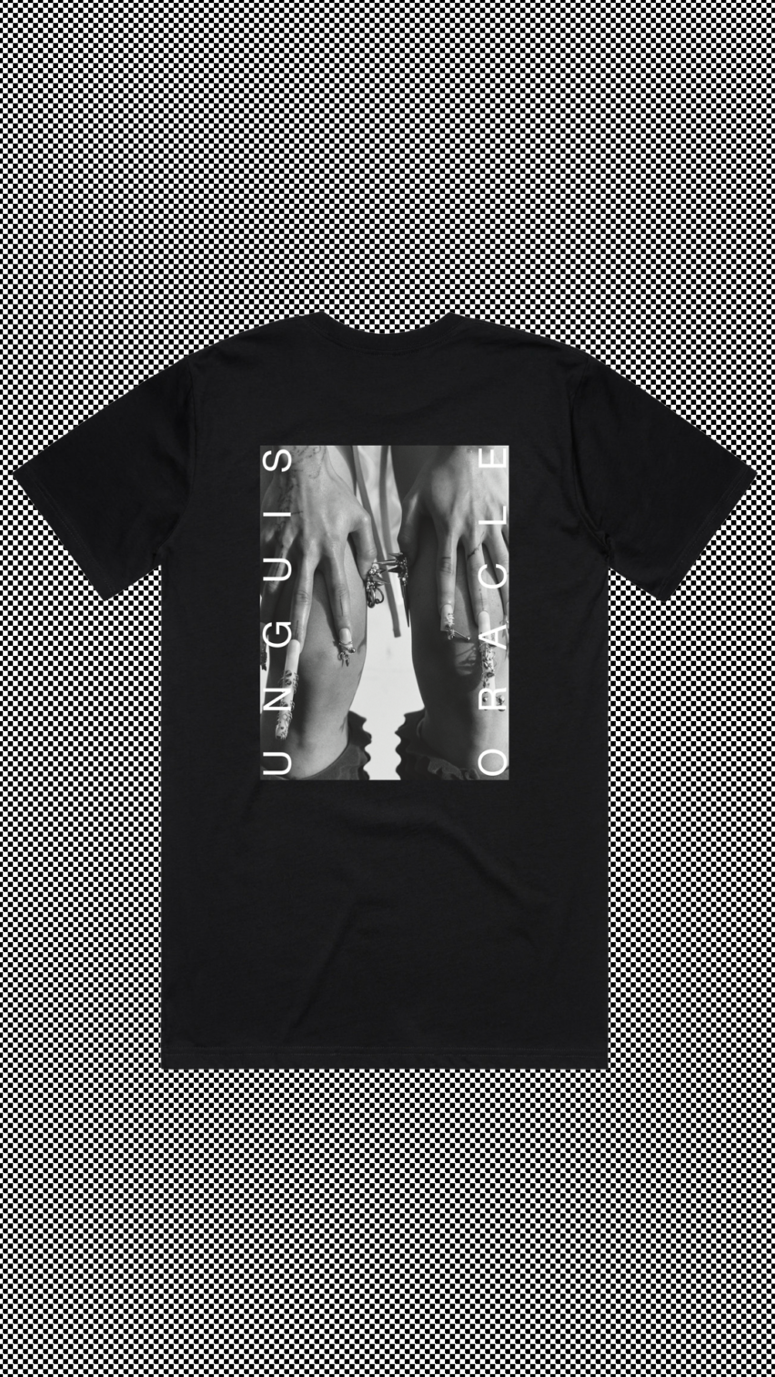
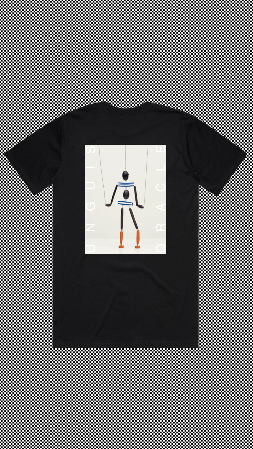
In our screen-dominated world, Unguis Oracle offers a refreshingly tangible experience, celebrating the artisans – from jewelers to skincare creators – who understand touch as a vital part of their craft. Through a blend of photography and seasonal storytelling, the publication spotlights hands as our primary tools for connection, weaving hand care into creative practice to honor both the practical and poetic aspects of making.
Created by W+K Amsterdam’s Lead Studio Designer Karen van de Kraats, nail artist and Editor-In-Chief Daniel Smedeman, and Graphic Designer Anne van Bokhoven, the publication explores hands not only as physical tools, but as vessels for expression and connection. Each issue blends discovery with delight, fostering community between makers through the slower, more intimate experience that only print allows.
Read on for more about the magazine..
Launching in 2026, the project grew from a two-year dialogue between Karen and Daniel that began with a shared fascination with nail art.
“During the COVID lockdown, the intense focus on hygiene made me want to research and share beautiful products connected to hands,” recalls Daniel. As the concept grew, Karen invited Anne to join. “Anne brings a distinct aesthetic that complements ours, creating an intellectually challenging and inspiring collaboration,” Karen says.
The team’s focus soon expanded from nail art into a broader exploration of the hand as a universal symbol. For Daniel, the excitement lay in filling a void: “Nothing like this publication existed yet. It opened entirely new conversations and creative possibilities.”
“In an increasingly digital landscape, we wanted to focus on something physical and universal. The hand can be a tool, a body part, and a form of expression.” - Karen van de Kraats
The physical characteristics of the hand directly informed the magazine’s visual system. “The verticality of fingers guided how we approached columns and long-form content,” Karen explains.
Anne describes the visual tone as “timeless with a statement – elegant and definitely not boring.” The layout combines traditional newspaper structures with contemporary typography, using classic serifs alongside modern sans-serifs. Each issue also introduces a signature spot color, starting with a bold “Classic Red.”
Instead of literal interpretations, the team translated anatomy into design rules.
Freed from advertising limitations, contributors were given total creative freedom. Material choices were equally deliberate; the paper was chosen to feel soft and quiet. Readers are even encouraged to rotate the publication, physically engaging with the object.

From the start, the team rejected digital platforms in favor of a physical object – a direct response to social media saturation.
“The tactile allows for more curated food for thought,” says Daniel. “Constant digital information hasn’t been great for our heart rates.” Anne agrees, hoping readers use the magazine as an excuse to slow down, take their time, and “maybe throw their phones into the water.”
Working together on the project felt entirely organic. “We all stepped into the roles that suited us,” says Anne. “Everyone is open to listening and learning from each other. There are no egos.”
Follow Unguis Oracle on Instagram @unguisoracle
Unguis Oracle is now available in print at
@athenaeumnieuwscentrum @foam_amsterdam @ofrparis @magculture @pdf_seoul